Choose Love
|
|
|
|
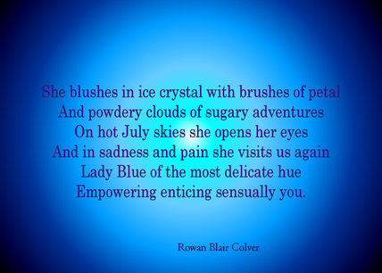
 For the Love of Blue Wlôwi, prãna, wiŋkiá, samtal, blou, xoči, larama and göy, the colour blue is a universal messenger. With so much to say for itself and so many moods, the colour of a cloudless daytime sky is also the description of sadness and loss. 45 nanometres are all that stand in the way of green and violet, with blue fitting perfectly at 450-495 nanometres on the electromagnetic spectrum. Of course, the colour itself is perceived in the mind and it is seen by us at this wavelength of light but for other beings, it is unknown. Indeed, it is even unknown if I see the same thing as you when we both look at something we both know is blue. There would be no way of telling unless we could somehow swap bodies and look with each other’s eyes and perceptions but keep our memories at the same time. Although beautiful and calming, peaceful almost, this particular pigment has quite a coloured history. For such a delicate and pleasant experience, blue has a lot of depth and intrigue. It has some of the most celebrated associations and some of the worst. A symbol for the Virgin Mary, its expensive pigment of purified ground lapis lazuli was reserved only for this purpose until the woad plant made its way into Christian Europe in the 15th century. It was then pushed forward as a popular colour for girls clothing until overtaken by pink in the middle 19th century. In China, the colour is associated with ghosts and trickery. In Central Asia it is the symbol of grief and mourning, a more hopeful version of the sombre black many of us are used to perhaps. Perhaps the only thing which is safe from aspects of this particular fraction is food. Apart from the cheese, which in all respect, is not blue until it contains mould, and the edibility of that is debatable, food is not generally blue. Even blue berries are more of a purple fruit. Chefs often wear blue aprons and use blue plasters when they cut their fingers. It sticks out and so food and things which are in close proximity to food but not food are easily found if lost. Azure, Electra, Cobalt, Sky, Ultramarine, Ocean, Baby and Powder. Some of the many variants of wall colouring we can choose from when decorating our home. Why choose this colour? Why would we want to splash the colour of sadness and ghosts on the thing we look at most often? Psychologists have looked into it for us and although making a textbook from a person is not ideal in any circumstance, their results are quite interesting. It may come as no surprise to you that the colour of the sky is a pleasant one, as is the colour of the sea or a lake. Perhaps to some religious minded people, the sky, or even a body of tranquil water could be quite heavenly. The peace of these things, the stillness and the natural tranquillity do make something to admire. Many flowers are blue, forget-me-nots and pansies both have blue in their spectral possibilities. I am yet to see and remember a blue rose, but I am sure they do exist. Birds and bugs often sport blue as their natural clothing, choosing its vibrancy and glamour over more camouflaged features. Even the odd tree frog has been known to proudly wear blue as its skin of choice. Finally, it has come to my attention during the research on this piece that in Germany, people use ‘blue eyed’ as a metaphor for naivety. It may be an extra layer of cunning to remember that blueness of the eye is an illusion caused by the refraction of light, much like that which creates the blue of the sky. Iris pigments range from brown to grey, any other colour is literally a trick of the eye. Have you noticed how many blue things you have recently? Go on, take a look around. |

Choose Love on Alternative Fruit is reader supported. Because of you, more people get to discover creativity and art for themselves. Thank you so much!
Follow the editor on Twitter
Archives
October 2021
|
|
Shop to Support Alternative Fruit
|
Thanks for supporting Alternative Fruit
Read our Privacy Policy here For people, for peace, with love. Made in the UK by Homunculus Media |