Choose Love
|
|
|
A masonic temple in Los Angeles is enjoying a second wind in the guise of an art installation. The Scottish Rite free masons who once held grand operas and theatre productions in the 2000 capacity building sold the temple to Guess Jeans co-founders Paul and Maurice Marciano back in 2013. The newly owning art foundation originally planned to cover the entire interior with white furnishings, however once gutted and the architecture was exposed, they decided to to keep everything bare. They hired artist and architect Kulapat Yantrasast to do the formal design work, and making use of the original trusses and joists was a bit of a gamble.
Some of the peculiar items left behind by the free masons have been used in the modern artistic exhibition. Artist Jim Shaw has created a piece called wig shop in which he recycles a theatrical backdrop of falling bodies on fire as part of his work. He's added his own images of painted superheroes, supermarkets, and supernatural creatures. Shaw found some old wigs lying around, in the basement of the disused temple, and he's placed them on simple mannequins which stand under a garish wig shop neon sign. He's added a few he made himself to complete the collection of headpieces. It sounds to me like there's an element of surrealism at hand plus the freemasonry combined with his own works perhaps lends him a bit of mythological favour. Curator to the exhibition, Philipp Kaiser, invited the display artists to take their pick of the unusual archival objects that were lingering in the old property. Likening the accumulation of ideas and props to a frenzy, Shaw responded by saying “magic thinking is manic thinking” (artnews). Jim Shaw is yet to have exhibited any works in L.A. And to this scale of event so it seems to be a lucky find for him. The Marciano brothers are hoping, as they did when they bought the property, that the art space will evolve into a culturally important and well received venue in the California scene. Quirky monumental designs such as the masonic temple, designed by eccentric artist Millard Sheets, make excellent alternatives to the strange and far reaching futuristic designs often chosen by big name art people. As a collection of modern art, the themes are varied and mainly inspired by the feel of the building. Masons used art to communicate ideas as many people were illiterate during their history, masons would include useful information in pictographs so that the everyday person could understand the models. This theme is continuing in this large and gutsy collection of modern art that occupies all floors in this obscure and fascinating building. 
Image source: Fubiz
In an abstract echo of the 2015 event, “Sounds of the City”, in which sound was used to form an impressive art exhibition, Brussels this year played host to Thalys organised “Scents of the City”. A spectacular creation of related olfactory experiences was presented from the 12th to the 14th of May 2017 which took visitors on an aromatic journey through the major cities connected by the Thalys train network.
Agnes Ogier, general director of Thalys, has explained that cities are more than their cliché imagery and the exhibition was more than just the smell of a postcard. Expert researchers were sent to each city on the list to capture what could be considered its Soul. She says that “A journey is a multisensorial experience in which perfumes play an important role” (Fubiz) The demonstration of multinational olfaction was designed to enlighten travellers and visitors to the scents and feelings of new places and to encourage journeys to the places mentioned. A selection of smells from Brussels, Amsterdam, Cologne, and Paris tested the nasal capabilities of those who passed by. These happen to be the very places you can get to via the Thalys. Creative agency Rosapark, perfume consultant Elizabeth Carre, Leonard Marchal from Drom Fragrances, and Studio Associe combined their efforts to produce a colourful and beautifully aromatic display that tantalised the senses over the three day period. Perhaps the scents naturally faded over time which made this art work fairly short lived. Definitely one to remember for those who were lucky enough to visit, the sense of smell is very important in the forming of memory. 
Image source: Fubiz

During the 1850s, art took a cultural turn. Something clicked in the mass consciousness of the new generation of artists that said “We want perfection”. The realism art movement came into being when artists decided that they needed to mirror the world around them in such absolute detail, that you could feel yourself in the painting, alongside its subject in real life. After the French Revolution in 1848, the Romanticism art movement became out of favour. It depicted “far out” scenes of high fantasy and whimsical, twee scenarios which didn't reflect the mood of the time. Finding the way to convey the true feeling of the people required a shift in artistic direction.
Perhaps the next generation of realism in the art world, the well made infographic is a masterpiece of art, design, and communication. Finding useful ways to demonstrate knowledge using artistic references alongside notes is not easy. We all tend to be superfluous and in an effort to ensure we are truly understood, make a point several times in various ways in order to let it really sink in. Combining images and short phrasing works in the way that it appeals to two distinct parts of the mind. We see the picture, we read the words, and we form a connection from the two. This double anchoring helps us to learn. In a world of fake news and out of proportion media reporting, perhaps like the French over a century ago, we're maybe a bit fed up of the "far out" and overly emotive art works and media sources that bombard us. Please, just bring back the sanity! By simplifying things to a degree that concentrates knowledge without losing any of its key ingredients, much like a well made fruit squash, when we absorb the wisdom and apply it to our life (the water), we receive the benefits of the thick and rich, shot glass education. Knowing where to put the facts and figures in the infographic so that one thing naturally leads to another requires an eye for artistic design. Knowing what to put in the information and how to best show it in pictorial form requires focussed and well sourced knowledge. Unifying these sometimes very separate worlds can create extremely useful nuggets of proverbial gold. Take a look at the world of chemistry, summed up on an infographic created by Dominic Walliman. 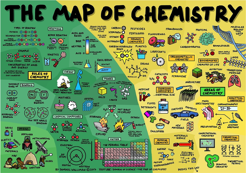
Chief curator at the French Pompidou Centre, Christine Macel, is this year's director at the Venice Biennial running the 13th May the the 26th November. Labelled Viva Arte Viva, the show is already conjuring images of vibrancy and togetherness. “Individualism and indifference” (The Art Newspaper) are the targets for the messages in the 120 artist deep show of talent. Perhaps dualistic in nature, the benefits of being individual and also not being different are well told, however the gist of this year's twist is that too much of a good thing can cause troubles and problems that transcend interpersonal realities.
Art is also there to transcend and bring awareness and empathic story telling through its imagery and presentation, and Christine is truly aware of this. She says, “For me, art has always been an activity of humankind that opens one’s self.” (TAN). She talks about the international reach of the Venice Biennial event and how the works will demonstrate their power no matter the origin of the spectator. Perhaps the iconography and cultural references will vary but the language of feeling is universally portrayed in images from any hand. Christine has worked closely with the artists to ensure that each layout is represented to its best potential and with discussions of the messages involved, a plan that incorporates good flow has been delivered to really give the event the artist's stamp of approval that it deserves. In this way it's achieved a level of communication that many biennials perhaps lack. With each contribution standing alone, it can often feel like a patchwork quilt of tangents and ideas but with this event and its micro-managed and democratically inspired planning the vision of the curator is as prominent as that of the individual artists. One particular group of artists from Kenya have only just made it to this year's event. Having been let down by their government and not given the money promised to fund their contribution, the Kenyan curator Simon Njami informed the Venice Biennial that their show would be cancelled. However, with the help of Venice based non-profit called Zuecca Project Space a floor at a local school was secured.
Experiments in design and trend don't tend to last very long. The world of imagery and symbology is continually shifting in time to the swaying of the Christmas tree, year after year new iconic motifs and design elements sneak their way past our initial shut off switch and begin making an impression on our habits. We gravitate towards the things that speak to us, via the previous experience that it reminds us of, in some round about way.
So it can be argued that the majority of design elements end up in the recycling bin, as new magazines and packagings are released, the old are disposed of in environmentally friendly ways and soon forgotten. For some, this is a travesty and the collating and preservation of historical design becomes a mission in the name of culture. West Michigan has played host to several artistic design innovations in its time, thanks to the thriving university campus which proudly holds many related subjects in its prospectus. The next generation in initiative rich design is perhaps the Graphic Design Archives of West Michigan, an online museum dedicated to the preservation of the ideas and themes represented over time. Although the digital realm doesn't provide the touch and feel element of real exhibitions, art isn't one we can usually touch anyway, so as a resource for information it stands on equal terms to a roofed hall. Perhaps being in the presence of the greats has an allure of its own, but considering the nature of the image in question, it can be assumed the originals don't hold the same quality as a Leonardo or a Picasso. The way businesses utilise imagery can be seen in the packaging and advertising used, the icons and emotive quality behind them tell stories about the products which relate to the people they are targeted at. By looking through archives of things like this, we can glean ideas and concepts as well as find out exactly what people are already thinking when it comes to what we want to market. 
The art world is mourning the loss of one of its greats as the news of A. R. Penck's passing hits the headlines for the start of May. The German born neo-expressionist is perhaps best known for his wacky and busy paintings depicting symbols and shapes from an entire cosmos of sub-conscious manifestations, the artist was also a sculptor whose pieces reside in some of the worlds most culturally rich establishments.
During his early career, Penck was living under the communist flag of the East German regime and his antics in creative expression caused the watchful eye of the secret police to carefully monitor his movements. Strange to think, but in the eyes of ultra-conformist authority anything that swims counter-current is seen as a risk to the societal status-quo. Brave work indeed, and he wasn't alone in his mission, as other big names such as Jorg Immendorff and Markus Lupetrz joined in with the establishment of neo-impressionism. It has been said that his paintings took inspiration from Klee and Mayan symbology, while his sculpting was built on similar rock to the Easter Island heads. Often remarked as crudish, the form called upon heavy handedness and less attention to detail which ultimately resulted in striking and intuitive creations. Penck would use everyday items for his sculpting, finding use for old cardboard, bottles, and newspapers. What is considered creative upcycling today is perhaps inspired by the work of artists like these. Because of his witness to World War II from the German side of the border, the art work is considered to resemble to trauma and effects upon the consciousness within his culture. The horrors of war are perhaps made worse by being on the losing side and although he was only a very small child, being born in 1939, there would have no doubt been a lasting impression of the aftermath. There is perhaps good reason why his works have been preserved and given the acclaim they received due to his association with these abstract but real human experiences.  A new theme is running thick through the blood of the Barbican this season, the fires are stoked and the dusty books are given a hearty blow for the Folk Horror mentality of deep and dank Britain. It wasn't too long ago when Christopher Lee and Dennis Wheatley were chilling the bones in theatres and cinemas across the world. The era of pagan based British dark culture perhaps had a moment in the shade while everyone rushed around for twenty years rediscovering existentialism but now the moon has turned blood red once more as a new generation of thrill seekers turn to the occult and archaic practices of forbidden rituals and lore. Part of the appeal for cult films about cults is that there is a tongue in cheek silliness to the ideas and portrayals of the theme. However, the individuals themselves within the stories are always driven to extreme acts due to their psychological involvement in such mysterious and firmly rooted beliefs. When newcomers to ancient practices are subsequently thrown knee deep into the ongoing evils of devil worship and satanism, superstitions and paranoias begin to dominate the atmosphere. It's a favourite brand for many, calling on the sickly feeling of abstract fear within the safe parameters of controlled media. As reported in the Guardian, the three directions of cult British horror that inspired the modern movement came from three distinct 1960's films. The Wicker Man took the pagan ritual of human sacrifice and created a scenario in which a blue collar worker is thrown into a realm of trickery, eventual betrayal, then burning alive. Because many witches and suspected witches were burned alive, the film made a very important statement, as well as having some fun with what is actually a peaceful and non human sacrificing ancient belief system. Another film that inspired modern British cult horror was Blood on Satans Claw which as the title suggests calls upon the inherent evil within Satanic practices and the resulting bloodshed. Nasty stuff indeed, which leaves The Witchfinder General as the final 60's masterpiece to complete the “trinity” of films that created the modern scene. As we all know, it has been and is still practised in some parts of the world, the trial and punishment of witches. It is an evil act created out of superstition and fear, which has no place in any civilised society. Playing on our innate fears and unspoken superstition is always going to be the role of horror artists, and perhaps the reason they do it is because they like to feel they are in control of what makes them the most afraid. When we are the ones writing the script and deciding on how the evil is going to act, we stand in a place of power, albeit internal, that perhaps helps us cope with what makes us afraid. And it gives the adrenaline junkies something to enjoy in the process, which is all good fun. |
Choose Love on Alternative Fruit is reader supported. Because of you, more people get to discover creativity and art for themselves. Thank you so much!
Follow the editor on Twitter
Homepage
 Archives
October 2021
|


 RSS Feed